Accessibility in content design means creating business communication assets that everyone can access and understand, regardless of their disabilities.
The Americans with Disabilities Act (ADA) requires businesses to make web content accessible to people with disabilities. This can include users who are blind, deaf, or must navigate with assistive technologies such as voice or screen readers. Failure to comply with ADA provisions can make a business vulnerable to lawsuits, financial liability, and damage to its brand reputation.
While the ADA is typically associated with physical spaces and accommodations, its provisions also extend to the digital realm. There are no clear regulations that define exactly what a compliant website looks like, but websites must offer reasonable accessibility to people with disabilities.
Passed in 1990, the ADA prohibits discrimination against people with disabilities. The goal is to ensure that they have the same rights and opportunities as everyone else. The ADA applies to many aspects of life, including workplaces, schools, transportation, and spaces open to the public. In 2010, the Department of Justice passed the ADA Standards for Accessible Design. This mandates all electronic and information technologies (like websites) must be accessible to those with disabilities.
Web Content Accessibility Guidelines
Since the ADA doesn’t provide specific guidelines for compliance, many companies follow the Web Content Accessibility Guidelines, or WCAGs. While they are not all-inclusive, WCAGs are internationally recognized and adopted standards. Everyone needs to be able to access the information that companies publish, whether it’s on a website, in an app, or printed on a page. Companies have a duty to consider audience members’ disabilities when designing their content.
The system is based on the following four objectives:
- Perceivable: observable content presented in multiple ways
- Operable: flexible interface allowing a range of input devices
- Understandable: clear, simple language with comprehensible functionality
- Robust: compatibility across diverse platforms, browsers, and devices
The WCAG defines three levels: A, AA, and AAA. In general, most significant organizations should seek to reach at least the AA level, which makes content accessible to users with a wide range of disabilities. Achieving the AAA level often requires significant website changes.
Accessibility Considerations
The following design considerations are a good start to making your business communication more accessible:
Alt Text
Key images on your website should have alternative (alt) text in the HTML. Visually impaired visitors often use a screen reader to read website content. Screen readers read the alt text aloud. Alt text also appears for everyone in place of the image if it fails to load.

Captions
Captions display spoken words and sounds as text for users with hearing impairments. Add captions to videos, e-learning modules, and anything else that uses sound to communicate your message.

Narration
Any time a visual element in a video or animation is critical to your message, it should be narrated. Some users may have difficulties with their visual senses, and narration ensures that they can perceive all the information available.
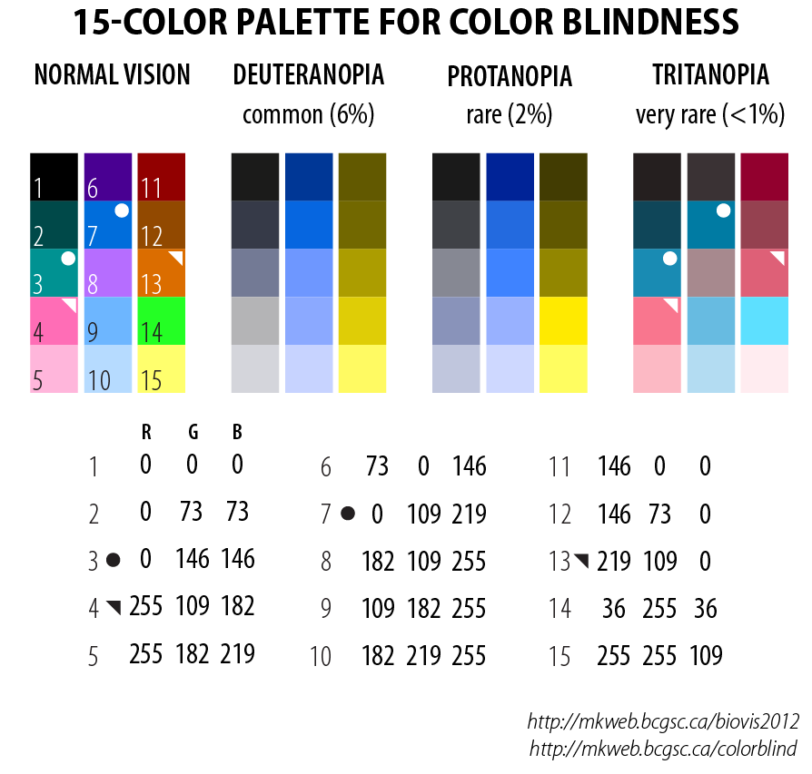
Color Palette
Choose color palettes that people with color blindness can discern whenever color choice is a functional rather than a decorative decision, such as color-coding, navigation, and warning systems.

Flashing Elements
Protect people with photosensitive epilepsy by adding a warning before displaying flashing elements, making flashing elements optional, using flash rates less than two Hertz, or avoiding flashing design elements altogether.

Keyboard Interface
Design website navigation to allow complete control with just a keyboard. In most modern browsers, pressing the tab key moves the focus to the next navigable element in the webpage. In Google Chrome, a URL preview appears in the bottom-left corner. Press the enter key to follow the link.

The Future of Accessibility
Accessibility is growing. New assistive technologies are making websites more accessible. It’s important for organizations to be proactive, not reactive, when it comes to ADA requirements. It benefits everyone to make your website and content accessible to all.